[ad_1]
I did a presentation at a couple of events in October and November that went through a fairly lengthy list of new features in Windows 11. This builds on the information that I previously posted on Windows 11, but I though it was still useful enough to turn those 56 slides into blog posts. In part 1, I’ll provide a quick overview and then review all of the UI enhancements. In part 2, I’ll talk about the in-box apps, core functionality, infrastructure changes, and removed features then wrap up with a discussion on hardware requirements (again).
First, you can catch up on some previous posts that I did on Windows 11 via a simple query (including a long blog on the hardware requirements). Now, let’s talk about a simple question:
Is Windows 11 a significant release?
This is a tough question to answer, because it depends on your perspective. There are certainly significant enough changes in the Windows 11 user interface to impact users. Will those require retraining? For some, possibly, but a good percentage are likely to adjust. For power users, they are likely to complain, as there are some shell features that just don’t exist any more.
But beyond the UI changes, most of the changes are more subtle and are less likely to impact organizations. Strangely, Windows 11 has no new significant security features. Rather, it focuses on changes to hardware requirements that are really designed to encourage more organizations to adapt existing Windows 10 security features.
There is one exception though: Support for Intel’s new 12th generation CPUs. While these processors will work fine with Windows 10, the performance is likely to be lower. Windows 11 contains optimizations, working with Intel’s Thread Director feature to route workloads to appropriate CPU cores, that aren’t present in Windows 10. Since these 12th generation processors contain performance cores (P-cores) optimized for performance and efficiency cores (E-cores), just like the latest ARM-based CPUs used in many phones, choosing the right core is a key task. At least that’s the theory, and in at least some scenarios that does appear to be the case, it may not be noticeable for typical information workers.
Overall, if you ignored the Start menu and Task Bar changes, you would see this as a standard feature update. Sadly, it can’t be deployed via an enablement package; you will need to do a full in-place upgrade to deploy this feature update.
What about those new hardware requirements? Suffice to say, they really have nothing to do with performance (as many people had assumed). More on those changed requirements later.
User interface improvements
There are certainly lots of user interface changes — Microsoft would position those as improvements, but some may have other opinions (hence why some of those improvements are being “further improved” in Insider builds that will likely end up in a future Windows 11 release, or perhaps even before).
There’s no doubt that this is the most significant change in Windows 11.

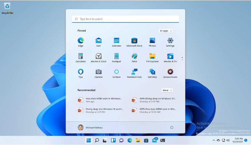
The Start menu is now centered and the size of it is fixed. You can have exactly three rows of icons, and even if you have less, the space taken up by three rows remains. If you have more than will fit on those three rows, the dots on the right side of the pane will show up and down arrows to let you page up and down.
There are also a small number of “Recommended” items that can include recently-used documents, app suggestions, etc. You can turn those off if you like, but you won’t get any of that space back — it will just be blank.
The Start menu itself, and the Start button and task bar contents, are centered on the task bar by default, but you can move it to the left via settings or policies.
You can still search for apps, either by just typing, or by clicking “All apps” and then searching (or scrolling through the full list, if you don’t have too many).
New Insider build capabilities will bring improvements.
If you look at the Start menu layout above, you can see that has a reasonable set of apps on it. That’s because the layout is from a Windows 11 Enterprise (or Education) installation. If you are running Windows 11 Pro, you’ll see different items:

Windows 11 Pro and Home will add up to 11 “dynamic layout” tiles to the layout, and you might not like them. (That’s the Pro set, the Home set will likely include games, e.g. Candy Crush.) You will also see Word, Excel, PowerPoint, and OneNote show up if Office is installed. On Enterprise and Education, add Outlook, Teams, Whiteboard, Flipgrid, and Minecraft for Education to that list.
You can still customize the Start menu layout, as you could do in Windows 10, but the process is changed — and generally for the better. You can customize the layout manually in the UI the way you want it, then export it to a JSON file using the same Export-StartLayout PowerShell cmdlet. Once you have that, you can paste the contents into a “Configure Start Pins” MDM policy; the pinned items that you specify will completely replace the default set. There are no more groups and no more partially-locked layouts; it’s all or nothing.
There is also no Group Policy setting for configuring the Start layout, although you can hack around that. See my previous post for more details on that process.
The new layout is applied when a new user signs into the computer. There is also a separate OEM policy that can be used to add a few new pinned items to the default layout, but since that’s really supposed to only be for OEMs, it’s best to ignore that one.
If by chance you are using Assigned Access to create a multi-app kiosk with a custom Start menu layout, that’s not supported at all Windows 11 at this point, so you’ll want to continue using Windows 10 in that case.
Task Bar
The changes to the task bar aren’t quite as significant. (That’s true for a lot of the subsequent UI changes too, which is a good thing, otherwise this blog post would be 100 pages long.) The biggest change is that the task bar must now always be at the bottom of the screen; there is no way to move it to any other edge of the screen as you could have done in the past. So if you were one of these odd people that liked it on the top, left, or right, you’re out of luck.

Icons on the task bar are now centered by default, although this can be changed to move the items to the left. You can still right-click on the task bar, but many of the familiar options that you used to see (e.g. Task Manager) will no longer be there. (The workaround for that is to right-click on the Start button instead.)
If you were one of the people who didn’t like the weather as it was added to the task bar on Windows 10, it’s now been replace by an icon that brings up the widgets panel (more on that later) that contains the weather. But new Insider builds have brought the weather back again (replacing the widgets button, so clicking on the weather can bring up the news, go figure), so don’t celebrate too much.
There is also a new “Chat” icon that launches a slimmed-down view into the consumer version of Teams that comes preinstalled, which can’t be used with Azure AD accounts, so it’s not useful for organizations; you need to install a different version of Teams for that.
There are policies available (including GPOs) to turn off the icons that you don’t want, or the user can do this themselves through the task bar settings (the only right-click menu option that you’ll see when right-clicking on the task bar).
You can still customize the task bar, as you did on Windows 10. More specifically, it’s exactly the same process as was used in Windows 10; there have been no improvements to the process. You can specify to replace all the default pinned items, or to just add a few new pinned items. You can export the task bar layout with Export-StartLayout as XML, then copy and paste only the task bar XML chunks into the existing Start menu layout policy (the same policy that you can’t use any more to configure the Start menu on Windows 11 — it’s no longer support on Windows 11 to do anything beyond configuring the task bar). This supports both GPO and MDM policies at least. See the official docs for more information.
Action Center and Notifications
To see the new Action Center, click on either the network or volume icons on the task bar.

For the new notification pane, click on the date and time:

These changes are at least reasonably straight-forward and shouldn’t phase too many people.
Rounded corners
These seem to be the new UI standard. (Thanks to Apple for that?). Whereas before all windows and dialogs in Windows has square corners:

They will now have rounded corners:

It’s a subtle change overall that many people won’t even notice. If you’re somewhat obsessive, you might notice that not all apps will have rounded corners — some may need to be updated (even Notepad out of the box) before they start using rounded corners. If you’re using an older version of Office (e.g. not Office 365) you’re probably out of luck.
Settings
The Settings app has been improved to make it prettier, better organized, and at least somewhat more complete:

But the legacy Control Panel is still around and still needed for some administrative tasks. Maybe one of these years Microsoft will finally manage to get everything moved, but that’s certainly not the case in the first Windows 11 release. New Insider builds continue to work on this, but it seems unlikely that even the 2022 Windows 11 release will be able to finish this task.
New System Font
The font used by Windows as the default system font has changed from the Segoe UI font used in Windows 10:

To the new Segoe UI Variable font used in Windows 11:

I do like the new font as it definitely adds to the more modern feel of the Windows 11 UI overall. See the Windows 11 typography documentation for more about this new font.
Snap
Windows 11 adds a new user interface element that shows up from the maximize button. This new Snap Assist capability lets you easily choose between a number of pre-defined layouts to snap multiple apps into some useful layouts:

Doing the same thing manually in Windows 10 was possible, but certainly not nearly as easy. If you try this yourself on Windows 11 and don’t see the three-column layout options, it’s probably your screen resolution: using three-columns requires a minimum screen width of 1920 pixels (1080p).
Once you’ve snapped windows into one of these layouts, it’s also easy to resize all of the windows at once. Just click on the border between windows and you’ll see a wider divider that you can move around to adjust all the impacted windows at once. Nicely done, and as you can see from the screenshot above, it is configurable if you don’t like the default behaviors.
Also, once you have arranged a set of windows the way you like them, they form a snap group that can be minimized and restored as a group. This can easily be done from the task bar.
Multiple desktops
The Virtual Desktops feature in Windows 10 has now been renamed to just “Desktops” (which is way less confusing). To see these, you can click on the “task view” button (or Windows-Tab) on the task bar (highlighted below, although you might confuse that button with the widgets button, since both are just multiple rectangles):

You can click on a particular desktop to see what’s on that desktop. If you want to move an app to a different desktop, just drag it to that desktop.
You can also change the desktop wallpaper independently on each desktop if you would like (e.g. a “business” desktop and a “personal” desktop).
Multiple display improvements
If you have multiple monitors connected to a laptop, you’ve probably seen this behavior with Windows 10: Disconnect the monitors (e.g. undock), all the apps move to the laptop display; connect the monitors back (e.g. dock) and you’re stuck having to manually move the windows back to the monitors they were on before.
With Windows 11, that should no longer be required. Windows will remember where app windows were located on each multi-monitor configuration (e.g. you use three monitors at work, but only two at home) and automatically move the apps back to the last recorded position when previously using that specific configuration.

Also, if an app is running on a monitor that goes away (e.g. undocked) it will be automatically minimized to the task bar, so you’re not left with all of the windows cluttering the remaining screen.
These behaviors are configurable through the new settings app. Also notice that the screen resolution is no longer hidden layers deep in the settings UI.
Widgets
As mentioned previously, the weather on the task bar that was added in Windows 10 is gone in Windows 11, replaced by a new widgets icon that brings up a set of web page-based widgets:

There is some customization that can be done by the user (adding and removing widgets), but the default display will show the same basic information that you would see on https://msn.com or the Edge new tab page. Only Microsoft-provided widgets are supported at this point (no third-party support yet). The widgets page also requires signing in with an online account (MSA or AAD). It’s also not clear if this should work for AD-joined devices (e.g. Hybrid Azure AD Join) or only with Azure AD-joined devices. (I only tried AAD-joined ones.)
Because some of the default content can be somewhat questionable (for example, maybe you don’t care about the “Top 21 celebrity cameos on the Simpsons” or what William gave Kate for Christmas), I suspect some organizations will prefer to turn this off via available policies.
Yes, it is possible to modernize the pop-up menus you see when you right-click in Windows. These have new rounded corners (of course) as well as new smooth animations, fonts, and icons:

But sometimes you’ll see the old menus show up. It’s not too hard to find them. For example, if you select the “Show more options” item above, you’ll see the old Explorer menu:

Why would you want this? Because third-party apps can extend the old menus, but not the new ones, so you need a way to get to the old ones.
You’ll also notice other random places where there are still old menus, e.g. on the recycle bin:

Some applications may need to make changes before these new-style menus can be used, so don’t be surprised to see this with some third-party apps.
Out-of-box experience (OOBE)
When you first boot up a new device running Windows 11 (at least one that isn’t using an unattend.xml) you’ll very quickly notice that the out-of-box experience (OOBE) pages have a completely different look and feel:

The left-hand side will show a pretty graphic, while the right-had side shows the “real” content that used to be centered on the page. (Not coincidentally, this design would happen to work very well on a dual-screen PC, e.g. Surface Neo, should such a thing ever be released.)
That’s mostly a harmless change, as most OOBE pages are somewhat sparse (e.g. choose a keyboard, type in your e-mail). But it’s less desirable when there is a need to display more information, e.g. when using the Windows Autopilot enrollment status page (ESP):

It is scrunched into a small rectangle, which guarantees that you’ll need to use the scroll bars to see the full content. That’s less than ideal, so hopefully that can be improved in a future release.
Interestingly, OOBE also has a new page added into it, bringing back the ability to type in the computer name. This doesn’t work when you’re using Autopilot or an unattend.xml, so it really only helps in consumer scenarios. In those scenarios, you’ll notice that if you type in a custom computer name and then click next in OOBE, the computer will restart. As always, Windows 11 still need a reboot to change the computer name.
Dark mode
Yes, Windows 11 includes a much-improved system-wide dark mode, and many (but not all) of the in-box apps support it. That’s likely to improve over time, but until then don’t be too surprised if you see some “blinding white” windows:

A new Notepad release that is currently being tested will take care of that one, but still no word on when/if Task Manager will be updated. Other apps (and some web pages, e.g. Linkedin) may also need updates to properly detect and use dark mode. But progress is being made.
Other stuff
There are some items that aren’t worth a section of their own, so let’s review those quickly:
- Windows 11 includes new icons, in the shell, right-click menus, settings, etc.
- There are improvements in touch support in the OS, increasing the space between buttons and other UI elements, and adding larger touch points to make it easier to use Windows 11 with touch. At the same time, there is no more tablet mode.
- Windows 11 adds support for pen haptics, e.g. pens that subtly vibrate when you are using them to simulate the feel of writing in paper.
- Windows 11 adds support for HDR video.
- Windows 11 adds new emojis (although not the same ones that were originally promised, search the web for “emojigate” for all the silliness around that).
That’s it for part #1.
[ad_2]
Source link


