[ad_1]
As we head into 2024, the air is filled with resolutions, aspirations, and goals for the new year. As individuals, we strive to better ourselves in the coming year. The Teams product team also strives to make your meetings better. We’re excited to share how Teams is getting better with updates that will help you customize every meeting, present content seamlessly, and enhance meeting efficiency with simplified processes.
Below we’ll take a closer look at how we’re evolving meetings in Teams to deliver new engaging and flexible controls that help you level up your meetings in 2024.
Meet comfortably and confidently with customizable meeting views
The meeting stage, or gallery, is at the core of the virtual meeting experience and can either hinder or enhance meeting efficiency depending on your needs. We’re excited to share how we’re evolving the default gallery experience in Teams meetings to give you a simpler, more predictable meeting presence—while enabling more controls that let you personalize the view to suit your preferences.
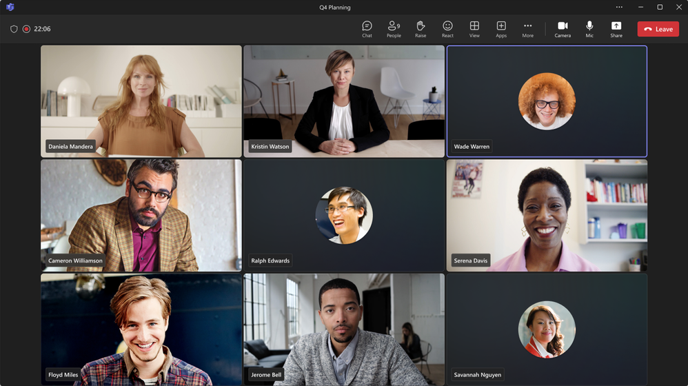
First, let’s look at the new default gallery experience that will be applicable to all. The new gallery will place everyone in tiles of equal size (16:9 ratio) whether their video is turned on or off. Additionally, the new default gallery layout will be more consistent and predictable for all meetings, regardless of size and content shared.
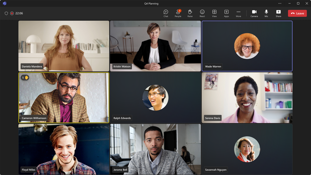
There are still a few default configurations that AI will optimize for to improve engagement and efficiency. For virtual participants, these are prioritizing those that have a raised hand and prioritizing the active speaker, enhancing their visibility so comments are not missed.
And when a Teams Room joins the meeting, the video of the room automatically enlarges, bridging the gap between remote and in-room participants. Remote attendees enjoy a clearer view and better connection, easily spotting who is speaking. Want a custom view? Simply tweak the tile size to your preference from the more options (…) menu by hovering on the room name. It’s seamless, inclusive, and ensures everyone can be seen, no matter where they are.
Next, let’s look at the controls that help you customize every meeting view to suit your needs.
While the default gallery size for meetings will be 16 participants, you can customize the number of participants visible on your screen to best fit your preference. You can choose from 4, 9, 16, and 49 participants visible on the screen for gallery size.
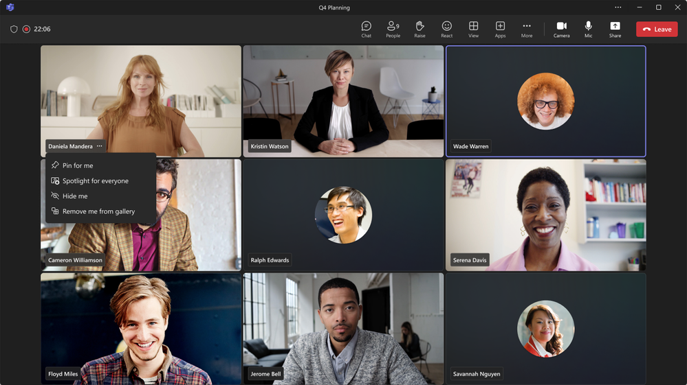
For some, having their own video visible to them on screen is a distraction. Now, you can opt to hide your own tile from your gallery view. This will not hide your tile from other participants, only your own gallery view.
When you don’t want to completely hide your video tile but want to change its position, you can also choose to remove it from the main gallery and position it either to the side or above the main gallery.
For meetings that have a mix of video on and video off, you can choose to prioritize tiles with video on in the main gallery to better connect with your teams.
The new gallery view updates are available in Public Preview starting this month. Learn more about gallery view on the support page.
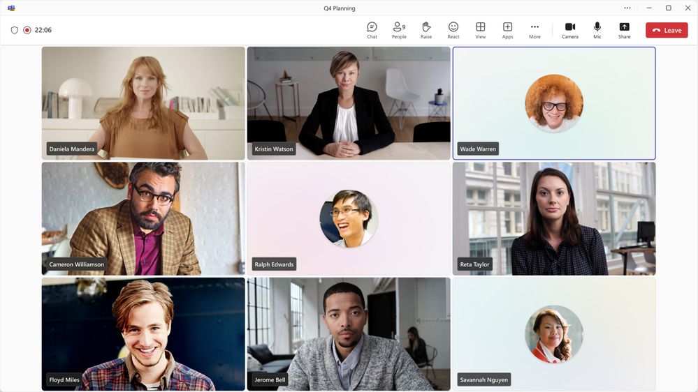
In addition to meeting gallery updates, we are also introducing more customizable options for the color scheme of your Teams interface. When you get tired of dark screens for your Teams meetings and calls, you can now brighten things up with the Light Theme option. Light Theme enables you to customize the appearance of your Teams client. You can change the color theme of your Teams client from the default Dark Mode to Light Theme from your Teams settings. You can join meetings with Light Theme too. Light Theme is available now for the new Teams app.
Save time with simplified meeting join
As our calendars become increasingly packed with virtual and hybrid meetings, the need for efficiency is more important than ever. To help address this, we’re rolling out new updates to enhance the meeting join process. These improvements will enable you to join meetings quickly and effortlessly, so you can dive into important discussions without delay.
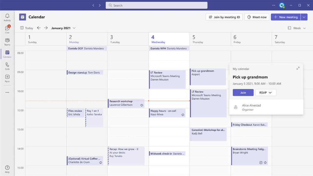
Let’s start with the invite, since the meeting invite is the first thing that a participant sees before joining. To ensure the most important information is visible and all the join options are clear, we are updating the invite design to better group related information as well as clean it up visually.
The simplified meeting invite will be available in February.
As part of the revamped invite design, we’re also improving the meeting join link by making it shorter. Sharing and joining meetings just got easier with a meeting URL that is shorter and clearer than before.
Shortened meeting link will be available in the second quarter of this year.
We’re also simplifying the experience of joining meetings across your different Microsoft accounts, with the ability to seamlessly join Teams (free) meetings from Teams for work and vice versa. This enables Microsoft Teams (free) users, those using a personal Microsoft Account, to directly join Teams for work meetings from within the client and stay connected even after the meeting has ended. This capability similarly enables Microsoft Teams (work or school) users to join the Microsoft Teams (free) meetings directly from within the client. With this simplified experience, you are no longer prompted to join via a browser and treated as a meeting guest (anonymous). This capability will be available in February.
Enhance efficiency with streamlined audio and video controls
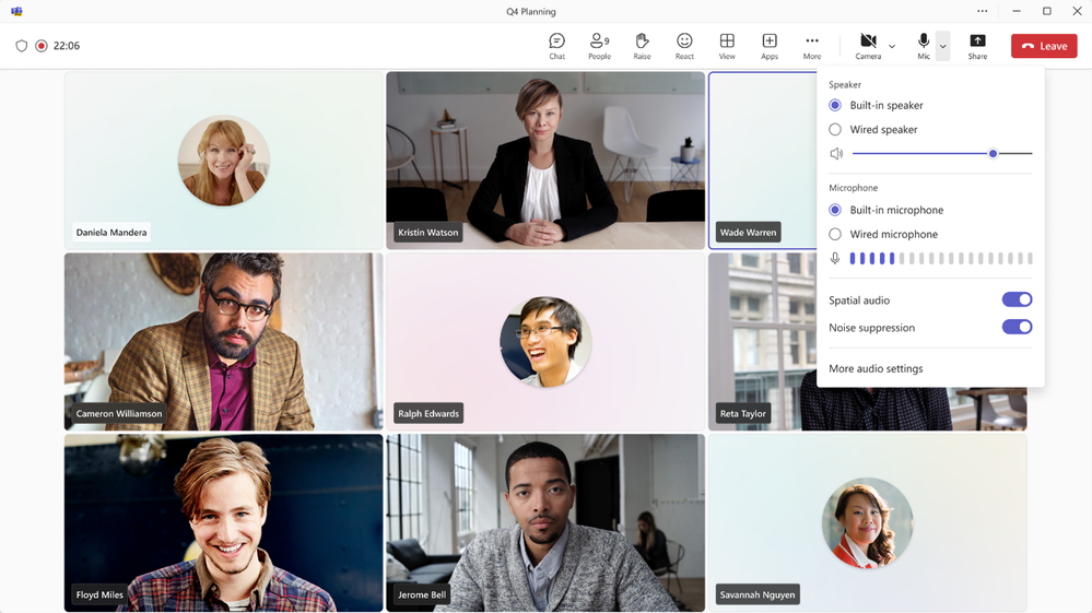
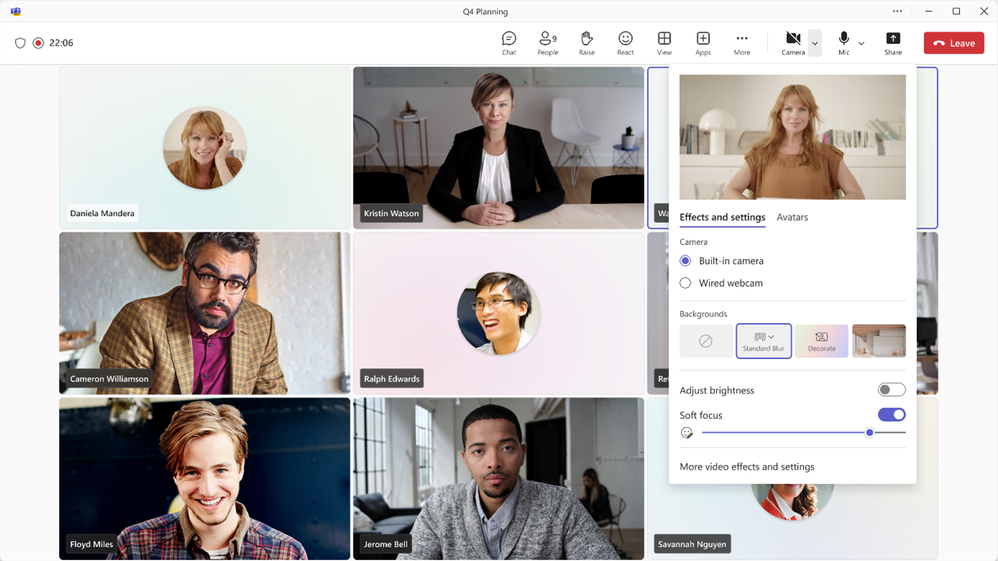
The efficiency gains extend beyond just joining meetings. We’re streamlining in-meeting processes as well, including audio and video controls. This enables you to focus on important conversations rather than navigating through the settings to make audio and video adjustments. Starting this month, we are rolling out audio and video flyouts in meetings, which are designed to make it easier and more efficient for users to manage their audio and video settings during Teams meetings.
Now, when you want to select your camera or mic device, you can choose the right device directly from the flyouts. You can also adjust the volume, spatial audio, and noise suppression controls from the audio flyout.
If you didn’t select your background during the pre-join page, you can easily change your background directly from the camera flyout. We’ve also made avatars accessible from the camera flyout so you can use avatars in meetings, and meeting reactions will be reflected by your avatar. You can also adjust brightness and soft focus from the camera flyout.
Collaborate without compromise, no matter where you are
In 2020 we launched Together Mode to make virtual meetings feel more personal by bringing everyone together in a shared background. Together Mode offers unique benefits by placing everyone in a consistent position in the shared virtual space, so the group has a common spatial perception of where everyone is. This improved spatial awareness helps you connect more naturally and reduce virtual meeting fatigue by more closely imitating the cognitive processing that happens when people are in the same room.
Now, Together Mode is getting better with a new layout for content sharing. Visually, this new layout moves the Together Mode video participants to the bottom of the screen so you can see remote colleagues with a shared background on a horizontal plane – similarly to the front row experience in Teams Rooms.
This new layout will give people in the room a greater sense of connection to remote participants, and extend the natural benefits of Together Mode to the points of a meeting when content is shared or presented. The new Together Mode layout will be in Public Preview in early February.
[ad_2]
Source link

