[ad_1]
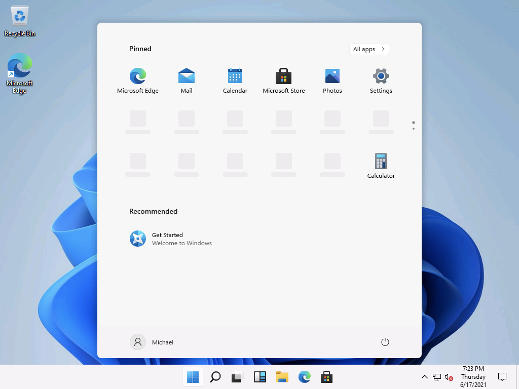
I initially installed the leaked Windows 11 build to see the changes for myself, as I mentioned in my previous post. After the installation, those changes were fairly obvious:

But if you notice, there are some blank “slots” for pinned icons in that list (with the dots on the side of the screen indicating that there’s another page with icons on it too if you scroll or click the dots). That’s tied to what I was talking about in my previous post: there’s a default list of things to pin, as you can see by peeking into the binary (because who doesn’t open these in Notepad just to see what’s in them?):

If you wanted something prettier, you can use strings.exe from Sysinternals. That shows you that there are actually two different lists:

Those are probably used depending on the Windows SKU. The bottom one is a shorter list, probably used on Enterprise and Education, while the top one has more stuff. Fortunately, both lists appear to be fairly focused on productivity-related apps, not games.
Those blank slots appear to be things that would have been pinned if they were present, but they aren’t. I’m also not sure what the “dynamic” slots are — perhaps the OEMs still have the ability to add some items? I hope those don’t end up being games (but if those are only for lower SKUs, that’s not too bad).
It does look like those blank slots disappear the next time you sign in (probably allowing enough time for the possibility of those apps being installed through some means, e.g. the store). Then you’re left with a more compact list that fits on one screen:

Seems reasonable. Weirdly enough, a local account that I created somehow reverted to the old Start menu without me doing anything, but the task bar is still the new layout.

Maybe that’s a bug? Hard to say.
But there are some additional twists here. It appears there are no more groups for categorizing apps — these are just individual pinned apps, and the “all apps” view that you can get to by clicking the button at the top right. That change probably means that there’s no more support for specifying your own Start menu layout (although maybe you can still specify individual items to pin?). The pinned icons are per user. So when I sign in as my account, I see one set; if I sign in as a different user, I see a different set. So you should think of these as “personal” items or favorites. That was the original intent with Windows 8/8.1.
So I’m guessing this means that the new Start menu doesn’t have the same functionality as the old one. You may *need* the old one if you are using a Start menu layout (via Import-StartLayout or similar methods with GPO or MDM), since this new Start would have no way understanding a layout with groups. That also likely applies to multi-app kiosks too. So the ability to change back to the old layout likely isn’t just to make it easier on enterprises who aren’t ready for change, but rather it’s needed for some scenarios to even work.
I don’t see any obvious signs of any policies related to the new Start menu (although I would expect there to be one that matches up with the HKEY_CURRENT_USERSoftwareMicrosoftWindowsCurrentVersionExplorerAdvancedStart_ShowClassicMode = 1 value that has been discussed in various online articles — just doesn’t appear to be there yet).
Fun times are ahead. I do like the overall look and feel of the Start menu and expect to have no issues using it myself, but I’m looking forward to seeing some official documentation that says what it will and won’t be able to do.
[ad_2]
Source link


