[ad_1]
Unless you’re living under a rock (in which case, you wouldn’t be reading this either), I’m sure you’ve seen that there was a leaked build of Windows 11 last week. But you might not have noticed the Twitter posts from people who posted screen shots of the new Windows Autopilot UI in OOBE. I finally got around to trying it out myself, and here’s what I saw.
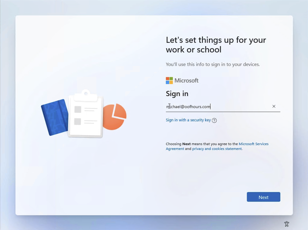
First, the Azure AD sign-in page is more or less the same, just shifted into the new OOBE style:

You might not have seen the “Sign in with a security key” option before, which supports password-less sign in using a FIDO security key. But otherwise, no big changes here. The password and optional MFA pages are similarly reformatted:

This next page might look at little weird to you, but I can explain: I’m running my own custom MDM service here (wrote it myself in Node.js for the entertainment value) and I implemented an MDM terms of use page with the standard OOBE style sheet from Windows 10. The page still displays, but it’s now squished into a rectangle. If I properly handled the new Windows 11 stylesheet, I could get the background color and styles to match, but without that you can at least more easily see the space that we’re working with here (with the left side of the page reserved for a pretty graphic):

(Interesting that it kind of looks like a book, where you could fold it in half…)
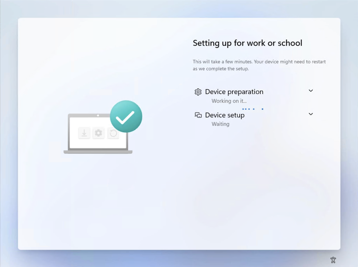
Next we see the device enrollment status page:

That looks OK, at least until you expand out the categories. Then it gets a little cramped and requires scroll bars:

Then we see the user’s first login happen (back to the normal blue screen):

After that, the user enrollment status page should appear. But instead, I was greeted with this error, which I’ve never seen before:

That could be a bug or work not yet completed. There was an error logged, not that it means anything to me:

So what else might you see in this flow? Two things that I can think of:
- Federated sign-in providers (e.g. ADFS, Okta, Ping, etc.). I’m guessing that these two will load in a small rectangle (they are just hosted web page) just like the terms of use page I included above. But since my tenant isn’t using federation, I can’t show that.
- Wi-fi connections and captive portals. Since I used a VM that was wired to my home network, you didn’t see the Wi-fi connection screen or any captive portal page. That captive portal page is also likely to be loaded in the same rectangle like the terms of use page above.
Assuming the issue with the user ESP is resolved and the web page-based stuff (terms of use or the Azure AD Conditional Access equivalent; captive portal; federated sign-in) properly renders in the smaller screen real estate, I wouldn’t expect too many issues from Windows 11 here. But when the “official” preview builds are available, you might want to try it out yourself, just in case.
In case you want to see the entire process, here’s a video that I captured:
[ad_2]
Source link


